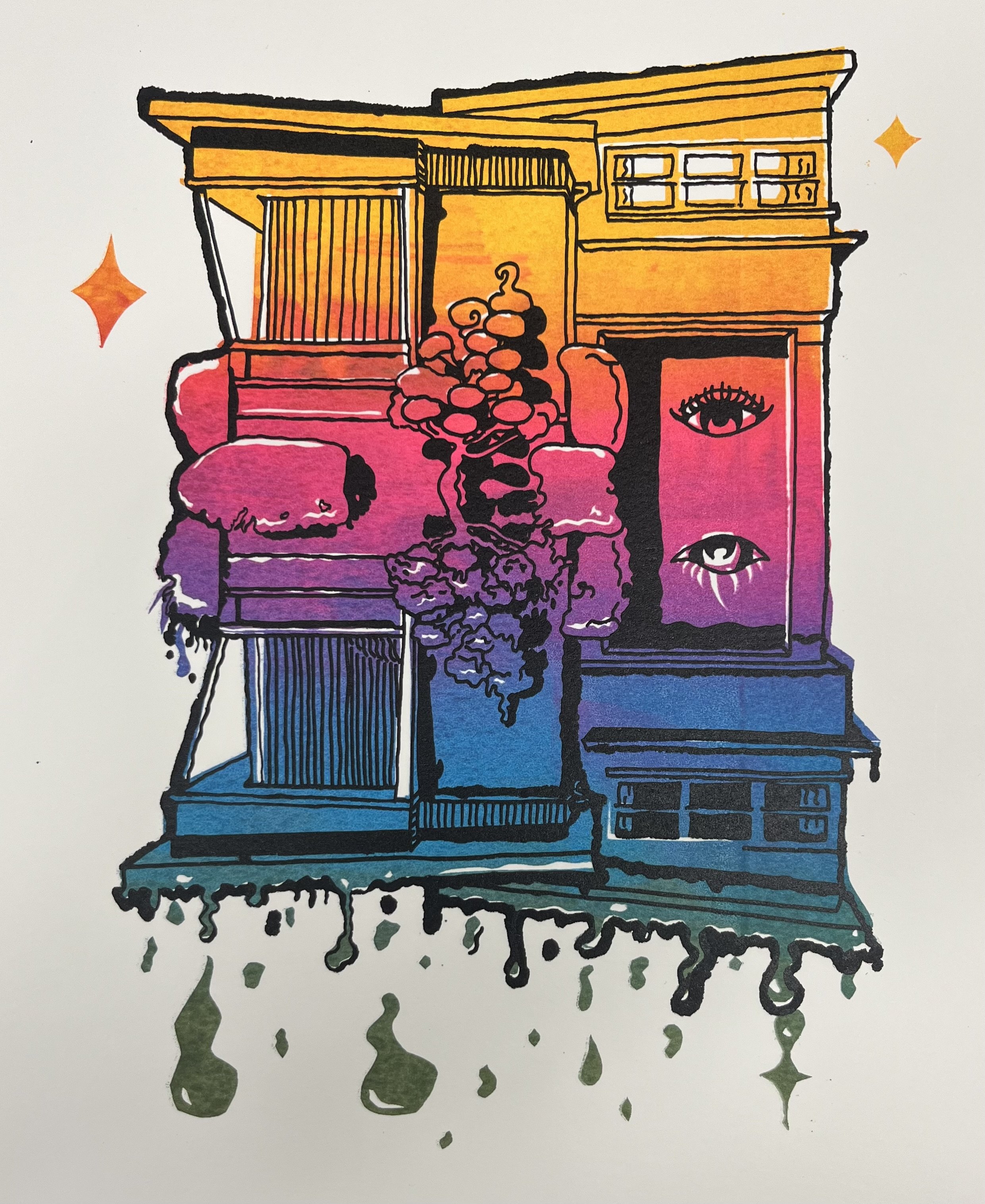
Welcome to the HOA
This is a two layered screen print made using rublith, matte duralar, and photo emulsion. The colors were made using a combination of the rublith and photo emulsion to create the main shapes. Then the line art was created with India ink on the matte duralar and photo emulsion. For both processes the screen was coated in photo emulsion and left to dry in a dark space. Then the rublith or duralar was placed on top and exposed to a light box. This created a stencil where the opaque mediums blocked the light and allowed the emulsion to be washed away.
The concept is the nightmare that is HOA’s. The top half represents the dream home that slowly morphs into a nightmare. You find your dream home, everything seems perfect, and then someone else who pays no bills there is telling you what you can and cannot do with it. The eyes on the side are people with too much free time always watching you. People who seem friendly at first then turn out to be the worst neighbors.
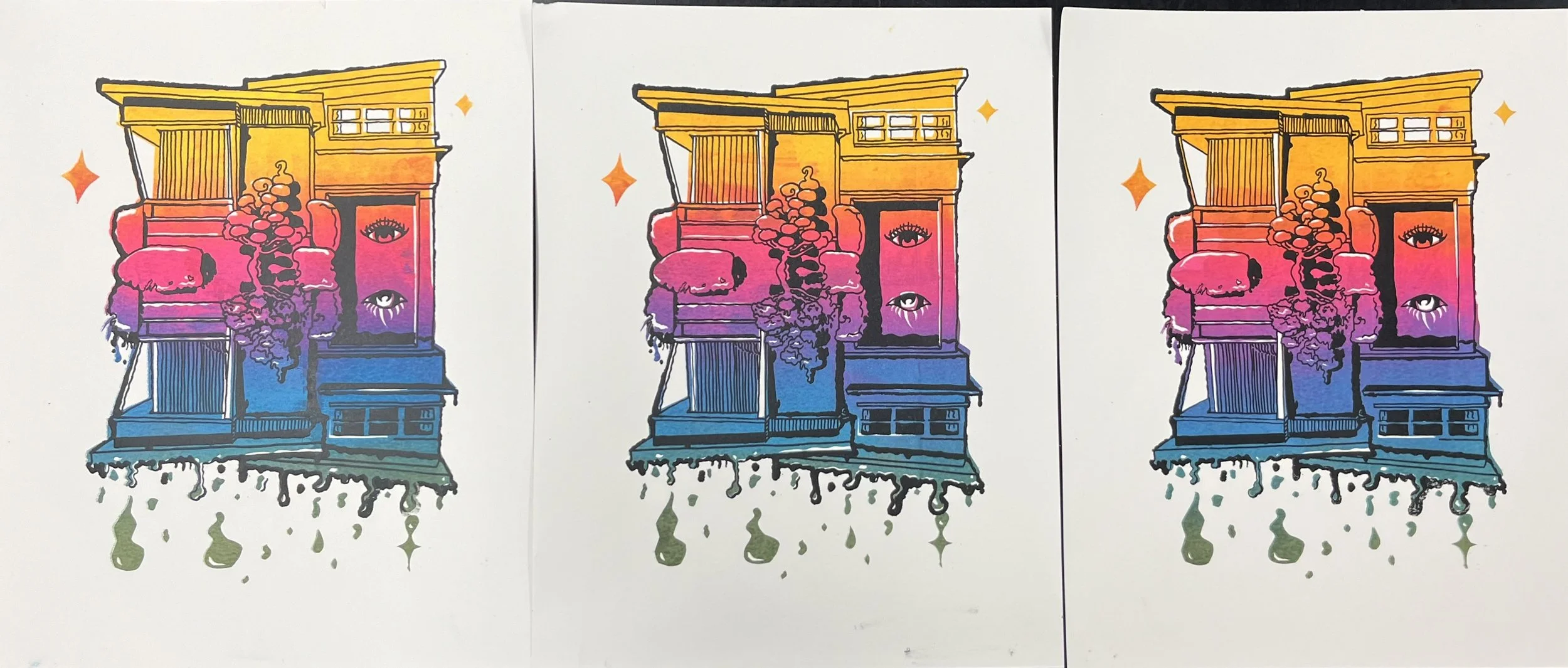
The first layer is a gradient of yellow, pink, blue, and green. All colors have a bit of gold ink mixed in to represent the phrase, “all that glitters isn’t gold”. Each print is slightly different because of the gradient. I like this because it gives each piece a unique feeling while still holding onto the cookie-cutter vibe of the suburbs. I wanted the top half to be bright, happy colors and the bottom ‘nightmare’ part to be darker, almost gross colors. The green at the bottom is the leftover ink from the Pepper Oni gradient mixed with lime green and gold to tie it into the other colors.
The house I found on Pinterest and choose for two reasons. The first is that I love mid century architecture and the second is because I feel that era perfectly symbolizes the ‘American Dream’. Representing the ideal American dream through the architecture was also a way to play on the dreamscapes theme.